Projects& portfolio:
Analyzing NYPD(New York City) motor vehicle collisions along with weather data& finding correlations
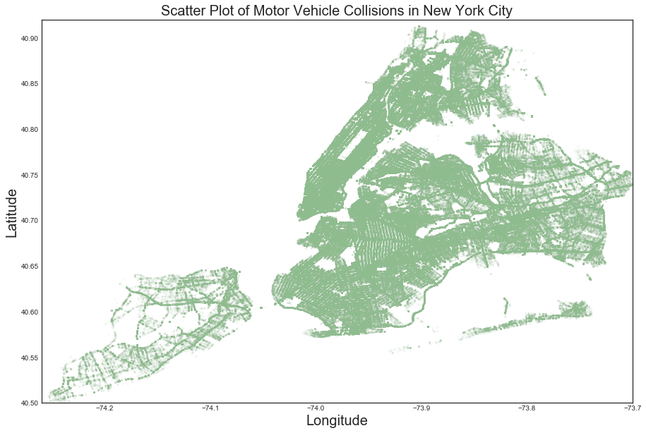
Have you ever wondered how to plot New York city base map? You can plot one on a latitude& longitude scale from collisions data.
In this work, I focused on analysis of the collision data and included the weather data of New York City (NYC) to investigate their correlations.
Specifically, the objective of the project is to study correlations between weather data and motor vehicle collisions data, data analysis using Python and to find some good features to predict/model vehicle collisions.
Scatter plot of all the collisions location resulted in New York city map.
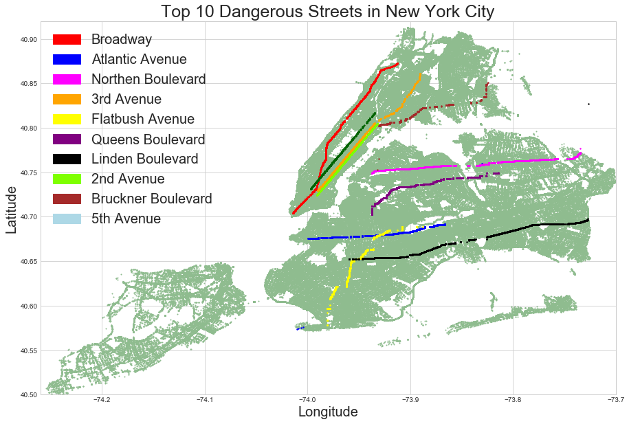
The top 10 dangerous streets in New York city according to motor vehicle collisions data:
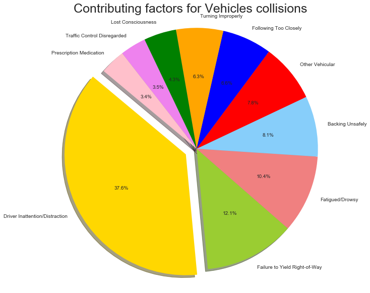
Contributing factors for vehicle collisions:
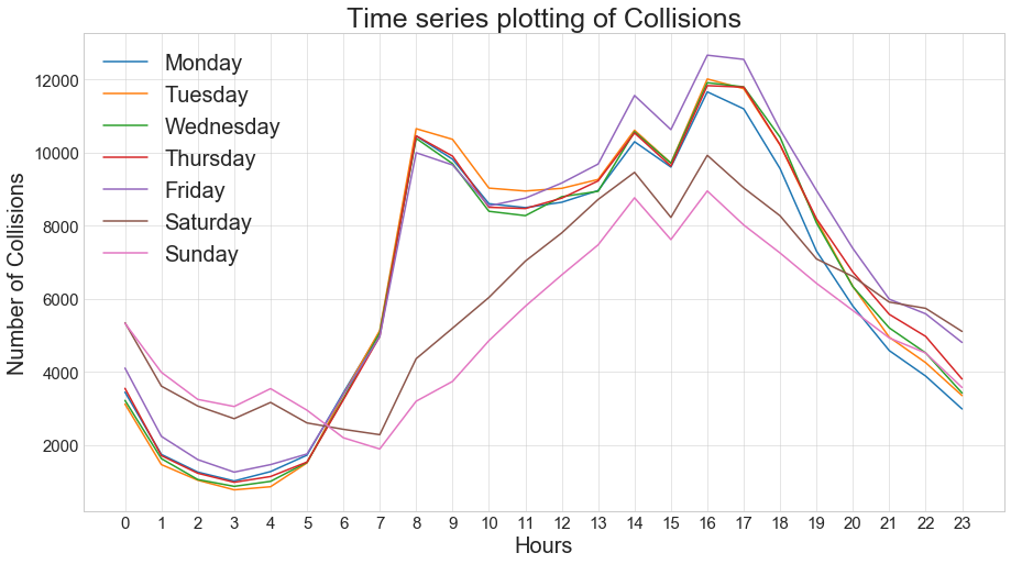
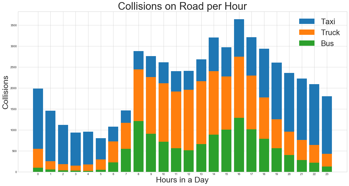
9:00AM-10:00 AM& 4:00 PM -5:00 PM observed the maximum collisions on weekdays.No wonder, that is general office commute time and normalizing with number of vehicles is necessary
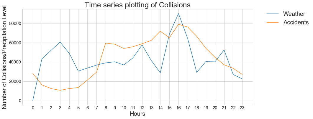
Time series plotting
correlation between temperature and collisions
Data:
The motor vehicle collision dataset includes the date and time, location (as borough, street names, zip code and latitude and longitude coordinates), injuries and fatalities and types, and related factors for all 65,500 collisions in New York City during 2016 and 2017.
The vehicle collision data was collected from NYC OpenData portal and weather data is collected from NOAA website.
All of the source code is written in Python, SQLite server and SQL using pymysql.
Technology stack used: Python, pandas, SQLite server, pymysql, matplotlib, seaborn and numpy
Sample code snippet is provided below: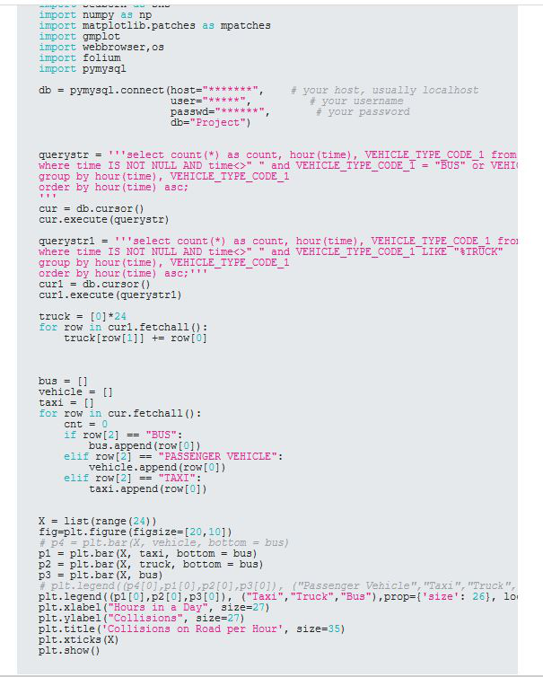
The detailed report, results, code and visualizations can be accessed at my git repo: NYPD motor vehicle collision analysis& correlations finding